


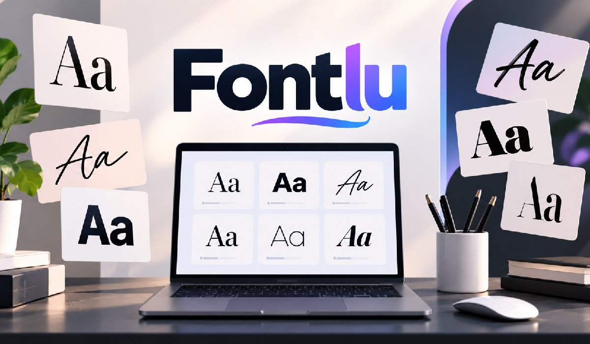
Typography has a major effect on how people understand and experience a design. A strong typeface can make a business look professional, while a soft or playful style can create a friendly feeling. Fontlu is presented as an online typography platform that helps users explore and preview different font styles before choosing one for a project. It brings font discovery and testing into a simpler workflow, which can be useful when a designer does not want to search through many separate websites.
The platform can support graphic designers, website creators, developers, students, business owners, and content creators. Users can test their own words and compare how they appear in different typefaces. This makes the selection process more practical because the decision is based on real project text.
Fontlu is especially useful during the early stage of design. Instead of selecting a font only because its standard sample looks attractive, users can examine readability, style, spacing, and overall visual character before making a final decision.
What Is Fontlu?
Fontlu is an online platform focused on font discovery, exploration, and previewing. Its purpose is to make it easier to examine different typefaces without downloading every font first. Users can enter their own text and see how various styles may appear in a logo, heading, website, social post, presentation, or another creative project.
It is important to understand the main purpose of the platform. Fontlu should not be confused with professional software used to draw characters and create an entirely new typeface. Its main role is helping users explore existing font choices and understand how they may look when applied to real text.
This approach can be useful for people with different levels of design experience. Professional designers can use it while researching typography, while beginners can explore fonts without needing detailed knowledge of type design. By making comparison easier, the platform can reduce unnecessary searching and help users build a more focused list of possible typefaces.
How Fontlu Works
The basic Fontlu workflow is straightforward. A user begins by exploring available fonts and can then enter custom text into the preview area. Instead of looking only at a font’s default sample, the user can see a real business name, headline, slogan, phrase, or other text in different styles. This gives a clearer idea of how a typeface may perform in the intended project.
For example, someone developing a company logo may be deciding between a bold modern typeface and a more traditional serif. Testing the actual company name can reveal differences that are difficult to notice when viewing generic sample text. Letter combinations, spacing, capitalization, and the length of a name can all influence the final appearance.
Fontlu can therefore be used before moving into design software. After narrowing the available choices, users can continue their work in tools such as Figma, Canva, Photoshop, or Illustrator, depending on their normal workflow and project requirements.
Main Features of Fontlu
Fontlu focuses on features that make font exploration more manageable. Font browsing allows users to examine different visual styles, while custom previews make it possible to judge those styles using actual project text. Search and filtering can also make a large collection easier to explore when a user already knows the general appearance or mood they need.
The preview feature is particularly important because typefaces can behave differently depending on the words being displayed. A font that looks attractive in a prepared demonstration may not have the same balance when used for a particular company name, heading, or phrase. Testing custom text gives users additional visual information before they commit to a choice.
Organized font discovery can also reduce the need to keep many browser tabs open. Rather than moving repeatedly between unrelated sources during the exploration stage, users can concentrate on comparing possible styles. The final decision should still consider readability, licensing, technical compatibility, and the specific requirements of the project.
Fontlu Font Preview Tool
The font preview function is one of the most practical parts of Fontlu because it allows users to evaluate typefaces in context. A person can enter the exact text they expect to use and compare how its appearance changes between fonts. This is useful for business names, headlines, product names, invitations, advertising messages, website headings, and social media graphics.
Users should examine more than the general appearance of the letters. Spacing between characters, uppercase and lowercase forms, numbers, punctuation, and the shape of commonly used characters can influence whether a typeface works well. Long and short words can also produce very different visual results.
Previewing can help identify problems early in the design process. For example, a decorative font may look attractive when displaying one short word but become difficult to understand when used for a complete sentence. Testing realistic content gives users a better basis for deciding where a particular typeface should and should not be used.
Exploring Different Font Styles With Fontlu
Font styles can communicate different visual ideas, so understanding basic categories makes font exploration easier. Serif fonts contain small finishing strokes on many characters and are commonly seen in books, editorial designs, and traditional branding. Sans-serif fonts remove those finishing strokes and are frequently used in modern websites, applications, interfaces, and minimalist visual identities.
Script and handwritten fonts imitate forms of handwriting or calligraphy. They can provide a personal or decorative appearance, but readability needs careful attention, particularly at smaller sizes. Display fonts are usually designed to attract attention in large headings, posters, packaging, or promotional graphics rather than long passages of body text.
Fontlu can help users visually compare these different approaches. The important point is that no category is suitable for every project. The typeface needs to match the purpose, audience, reading environment, and amount of text. Exploring several categories before making a choice can prevent a design from becoming visually mismatched.
How Fontlu Helps Graphic Designers
Graphic designers often evaluate several typography options before deciding how a project should look. Fontlu can support this research stage by allowing designers to compare possible fonts before spending significant time building complete layouts. This can be useful for logos, posters, advertisements, packaging, presentations, invitations, banners, and social media graphics.
A designer working on a logo, for example, may begin with several possible visual directions. Testing the brand name across different fonts can quickly show which choices feel too decorative, too formal, too heavy, or difficult to read. The designer can then create a smaller shortlist for deeper testing inside professional design software.
This approach does not replace normal design judgment. Typography also depends on size, spacing, color, hierarchy, surrounding graphics, and the intended medium. However, using Fontlu during early exploration can reduce random searching. Designers can spend more time evaluating relevant choices and less time repeatedly downloading fonts that may not suit the project.
Using Fontlu for Branding and Logo Design
Typography is an important part of brand identity because written language appears across many customer touchpoints. A company’s typeface may appear in its logo, website, advertisements, social media graphics, presentations, packaging, and printed material. Fontlu can help during brand development by allowing users to compare how a business name or slogan appears in different typography styles.
Different typefaces can create different impressions. A clean sans-serif may support a simple contemporary identity, while certain serif styles can create a more traditional editorial appearance. Decorative or handwritten styles may be suitable when a project needs a more informal visual character. The correct choice depends on the specific brand rather than a fixed rule.
Consistency is equally important. A font should not be selected only because it makes the logo attractive. Designers should consider whether the wider font family can support headings, supporting text, and other brand communication. Testing these requirements early can contribute to a more consistent visual system.
Fontlu for Websites, Apps, and UI Design
Typography has a functional role in websites and applications because users need to read information and navigate interfaces quickly. Headings, menus, buttons, forms, labels, notifications, and body text all depend on clear typography. Fontlu can support the visual research stage by helping designers and developers compare potential fonts before they implement them in a digital product.
A font that performs well in a large heading may not work equally well in small interface text. Developers should therefore test realistic examples rather than judging a typeface from a single large preview. Character clarity, spacing, weight, and readability can become particularly important when users view an interface on smaller mobile screens.
Fontlu previewing is only part of the web-font selection process. Before implementation, teams should also verify whether the license permits web or application use. Font formats, loading performance, available weights, browser support, and technical delivery also matter. A visually suitable font still needs to meet these practical requirements.
Fontlu for Content Creators and Small Businesses
Content creators regularly use typography in thumbnails, digital posters, social posts, videos, presentations, advertisements, and branded images. Small businesses may face similar needs without having a dedicated graphic designer. Fontlu can make early typography exploration easier by allowing these users to compare styles with the words they actually plan to publish.
The type of content should guide the selection. A bold display font may be effective for a short event heading, while the same font could be uncomfortable to read in a long educational post. A cleaner typeface may work better when the main goal is presenting detailed information. Testing realistic text helps users recognize this difference before publishing.
Consistency should also remain a priority. Changing fonts repeatedly between social posts, website graphics, and marketing material can weaken visual continuity. Choosing a small, practical typography system can make future content easier to create. Fontlu can help users explore the options before establishing those repeated design choices.
Free and Premium Fonts
Free and premium fonts can both be useful, but price alone does not determine whether a typeface is appropriate. A well-designed free font may provide everything a personal project or small website requires. Premium families may provide additional weights, italics, language support, symbols, alternative characters, or licensing options that become valuable in larger professional projects.
Users should first determine what their project requires. A simple poster may need only one or two styles, while a complete corporate identity could require light, regular, medium, semibold, bold, and italic versions. Selecting a family with sufficient variation can help maintain consistency without introducing unrelated fonts simply to create hierarchy.
Fontlu can assist during the exploration stage by helping users compare visual choices. However, users should verify what is actually included with the font they eventually obtain. They should also check whether its license matches the intended use. A free download does not automatically mean unrestricted use, particularly in commercial work.
Font Licensing and Commercial Use
Font licensing is a critical part of typography that can easily be overlooked. A typeface can be available to download while still having restrictions on how it may be used. Some fonts permit personal projects but require another license for commercial activity. Other licenses may contain separate conditions for websites, applications, products, advertising, or other forms of distribution.
For this reason, users should not assume that previewing a typeface through Fontlu gives them permission to use it anywhere. Before publishing commercial work, they should identify the relevant font source and read the applicable license. When the terms are unclear, checking information from the original designer, font foundry, or authorized distributor can provide better guidance.
Licensing becomes particularly important for client projects, business logos, websites, mobile applications, merchandise, packaging, and paid advertising. The exact conditions can differ between fonts. Taking a few minutes to understand those conditions before completing a project can prevent the need to replace an unsuitable font later.
How to Choose the Right Font Using Fontlu
Choosing an effective typeface starts with understanding the purpose of the project. Users should consider what they are creating, who will read it, where it will appear, and how much text needs to be displayed. These questions provide a practical basis for exploring fonts instead of simply choosing whichever style looks most unusual or attractive.
The next stage is realistic testing. Fontlu can be used to preview the actual company name, headline, slogan, or sentence that will appear in the finished design. Users should examine uppercase and lowercase letters, punctuation, numbers, spacing, and different word lengths. A typeface should also be tested at sizes similar to those expected in the final project.
Readability should remain central to the decision. Decorative details can support visual personality, but they should not prevent the audience from understanding the message. Comparing several similar options is useful because small differences in character shape and spacing can have a noticeable effect on clarity.
Common Font Selection Mistakes
One common typography mistake is choosing a font entirely because it looks attractive at first sight. A highly decorative style may work for a short heading but become difficult to read when applied to several sentences. Fontlu previews can help users identify this problem by allowing them to test longer and more realistic text before making a final selection.
Another problem is using too many unrelated typefaces in one design. Multiple fonts can compete for attention and make the visual hierarchy confusing. In many projects, a carefully selected family or a limited combination of compatible typefaces is easier to manage. Differences in size, weight, and spacing can create hierarchy without requiring a new font for every element.
Mobile readability should also be considered. Text that appears comfortable on a large desktop display may become crowded on a smaller screen. Users should therefore treat Fontlu as an exploration tool and continue testing their typography inside the actual environment where the finished design will appear.
Fontlu vs Other Font Platforms
Fontlu exists within a wider ecosystem of typography resources, and different platforms serve different needs. Google Fonts, for example, provides a large collection of open-source font families and is widely used for web typography. Adobe Fonts is closely connected with Adobe’s creative applications and provides type resources to users within the Adobe ecosystem.
Fontlu’s role, based on its described functionality, is centered more strongly on straightforward font exploration and previewing. This can make it useful during the early stage of a project when the main goal is to see different styles, test custom words, and narrow a large set of possible choices before moving further into the design process.
These services do not necessarily need to replace one another. A designer may use a discovery or preview platform to develop ideas and then obtain the final font through an appropriate source. The best workflow depends on licensing requirements, software, technical needs, budget, and the type of project being produced.
Is Fontlu Safe and Worth Using?
When evaluating Fontlu or any online typography resource, users should separate font previewing from downloading external files. Browsing and testing styles can be useful for design research, but downloads should still be approached carefully. Users should check the source of a font, understand its license, and avoid files or download locations that appear unclear or untrustworthy.
When possible, obtaining the final font from its original designer, established foundry, or another authorized source can make it easier to verify licensing and file information. Normal browser and device security practices should also be followed when downloading anything from the internet. A preview does not by itself establish that every external download associated with a typeface is suitable for use.
As an exploration resource, Fontlu can be useful for users who want to compare typography before committing to a design direction. Its practical value comes from simplifying early research. Final decisions should still include licensing, readability, technical compatibility, and source verification.
Best Ways to Use Fontlu Effectively
Users can get more useful results from Fontlu by testing realistic content instead of relying on a single sample word. A logo designer should enter the actual brand name. A website designer can test headings and sentences. Someone making a poster can enter the main event title. Real content reveals character combinations and spacing issues that generic samples may hide.
It is also useful to compare several closely related fonts. Two sans-serif typefaces may appear almost identical initially, but differences in width, letter shapes, punctuation, and spacing can become noticeable once actual content is entered. Keeping a shortlist makes these comparisons easier and prevents the selection process from becoming unnecessarily broad.
Users should then test their shortlisted choices in the final design environment. Fontlu can help with discovery, but context ultimately determines whether typography succeeds. Screen size, background, surrounding elements, text length, hierarchy, and font size can all affect the finished result.
The Future of Fontlu and Online Typography Tools
Online typography tools are becoming increasingly focused on making font discovery faster and easier for people with different skill levels. Traditional font selection can involve searching large libraries, opening many pages, downloading files, and testing them manually. Preview platforms simplify part of this workflow by allowing users to evaluate visual possibilities earlier in the process.
Future typography platforms could potentially make discovery more contextual through smarter search, improved filtering, font-pairing assistance, better multilingual previews, and recommendations based on project type. Such capabilities would be especially useful for users who understand the visual result they want but do not know the technical names of suitable font categories. These possibilities should be treated as general directions for online typography tools rather than confirmed Fontlu features.
The basic requirement will remain unchanged. Typography needs to communicate information clearly while supporting the intended visual identity. Better discovery tools can make finding candidates easier, but human judgment remains important when evaluating readability, appropriateness, consistency, licensing, and final implementation.
Conclusion
Fontlu provides a straightforward approach to one of the most important early decisions in visual design: choosing typography. By helping users explore fonts, preview custom text, and compare different visual directions, the platform can make font research more organized for designers, developers, business owners, students, and content creators. Its usefulness is particularly clear when someone wants to test real project text before moving into a complete design.
However, choosing a typeface involves more than finding an attractive style. Users should consider readability, audience, project purpose, font family options, screen performance, consistency, and technical requirements. Commercial projects also require careful attention to licensing and the source from which the final font is obtained.
Fontlu is therefore best understood as part of a broader typography workflow. It can help users discover and narrow their choices, while careful testing and license verification help turn those choices into typography that is practical, readable, and appropriate for the finished project.
(FAQs)
What is Fontlu?
Fontlu is an online typography platform designed to help users explore, preview, and compare different fonts. It can make choosing suitable typefaces easier for branding, websites, logos, social media graphics, and other creative projects.
How does Fontlu help designers?
Fontlu allows designers to test their own text with different font styles before making a choice. This helps them compare readability, letter shapes, spacing, and overall appearance during the early stages of a design project.
Can Fontlu be used for branding and logo design?
Yes. Fontlu can help users preview business names, slogans, and other brand text in different typefaces. However, the final font should also match the brand identity, remain readable, and have suitable licensing rights.
Are all fonts on Fontlu free for commercial use?
Users should not assume every font is free for commercial use. Font licenses can have different conditions for personal, business, web, app, or product use. Always verify the specific font license before using it commercially.
Is Fontlu useful for website typography?
Fontlu can help designers and developers explore potential fonts for headings, branding, and other website elements. Before using a font on a live website, they should also check readability, web licensing, available weights, formats, and performance.
