


Yellow is the one that makes people stop scrolling. There’s a full set in it, bright from collar to ankle, and plenty of people put it back down within about four seconds because they can’t picture where on earth it goes. Which is fair enough. Most of what sits on the shelves at Gallery Dept is far quieter than that — gray mélange, navy, black, cream — and honestly it’s the quiet colors that catch people out, because they look simple and then refuse to behave simply once two of them end up in the same outfit.
Not one flat color in the place
Plenty of these garments are garment-dyed or vintage-washed, so the color landed after the piece was already sewn. There’s movement in the surface. Not patchy, just nowhere near printer-flat, which quietly changes the pairing math — a flat color either matches or it clashes, whereas a washed one is forgiving and sits beside more things without starting anything.
The palette, as it currently stands:
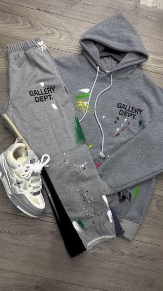
- Gray mélange, far and away the most common — hoodies, and the Logo and Paint Splatter sets
- Navy, in the Hollywood CA set and on a trucker cap at €35
- Black in two moods, new black and nero slavato, the washed one
- Cream, on the Reverse Logo hoodie and the Sport Elegant DÉPT joggers
- Oatmeal mélange, which exists on exactly one thing, the French Logo t-shirt
- Yellow, basically confined to the Hollywood CA Logo set
Mélange is gray with a texture problem
Mélange is less a shade than a mix — pale fibers and dark ones spun up together, so from close range you see the speckle, and from any distance your eye just blurs the lot into one tone. That blurring is where people get caught out.
A gray that won’t hold still
Six meters down a tram in Milan, a gray mélange hoodie looks a shade lighter than it did in your hands, because at that range the pale fibers do most of the talking. Then you walk indoors under a warm bulb and it drifts beige. Same hoodie, honestly. So check it near a window, not in a hallway mirror where the light’s lying to you.
Flat black makes it look pale, which nobody expects
Gray mélange hoodie, hard black joggers — on paper about as safe as pairing gets, and in practice the flat black sits there so solid that the mélange beside it gets shoved up the scale and reads nearly dusty-white, with a hard line across your waist where you wanted a gradient. Not wrong, exactly. Just louder than you planned for, which is an odd thing to say about gray.
Washed black sorts it. The nero slavato pieces have grayed off a touch, so the contrast drops from a cliff to a slope, and the gray gets to stay gray.
The yellow set is either everything or it’s too much
The Hollywood CA Logo set in yellow is the only properly loud color here, and it runs on one rule: it’s the whole outfit or it’s a mistake. Top and bottom at €100, white trainers, nothing else with an opinion. Somebody in Bologna on a flat February afternoon will look straight at you. Rather the point.
Split it up and the arithmetic falls over. Yellow sweatshirt, black joggers — shouty up top, nothing below, and your eye wanders around looking for somewhere to land. Yellow joggers under a dark top is worse, since bright trousers pull your eye down. The sets on the Gallery Dept Tuta page sort of settle the argument for you, because both halves turn up together at €100, and they were dyed as one item, so you aren’t left guessing whether the two yellows agree.
| Pro Tip: Want the yellow without wearing it head to toe? The black-and-yellow Dépt de la Galerie hoodie at €70 puts it in the print instead — roughly a tenth of the surface, and about a tenth of the nerve required. |
Two blacks in one outfit, and cream that needs rescuing
Washed black with new black is the mix people fret over, mostly for no reason. Put a nero slavato t-shirt with the Logan Dépt de la Galerie joggers and yes, you’ll see it — the tee sits a touch grayer, a touch softer — but it still just looks like two black things, which is what it is. What does fall apart is a washed black under a brand-new black coat, where the coat’s a fresh slab and everything under it looks tired.
Cream is the other one. A cream hoodie with cream joggers is a lovely idea for about half an hour, then you catch yourself in a shop window and realize you’ve gone out in indoor clothing. There’s no weight to it, so nothing anchors the bottom half and the whole thing floats off. It wants something dark below the waist, or a dark layer on top.
A few pairings that hold up:
- Cream Reverse Logo hoodie over dark trousers, sleeves pushed up
- Cream Sport Elegant DÉPT joggers under a washed black t-shirt at €50
- Oatmeal mélange French Logo tee with navy, since the warm beige and the cool blue stay out of each other’s way
- Gray mélange head to toe with a washed black tee showing at the collar
Navy’s worth a word on its own. It pairs about the way black does but keeps a little warmth, which is why cream sits happier beside navy. Naples in April, nobody committing to a coat — navy set, that €35 cap, done.
Frequently Asked Questions
Is nero slavato faded, or is it supposed to look washed?
Supposed to. That wash went on while the garment was being made, not in somebody’s machine later. Wash it inside out at 30 °C, leave the dryer alone, and it sits roughly where it started.
What goes with a cream hoodie so it doesn’t read as loungewear?
Anything dark below the waist — trousers, black joggers, a dark skirt. Barely matters which, as long as there’s weight down there. Keeping the hood down helps too. A cream hood up is most of what makes it read as pajamas.
Can navy and black sit in the same outfit?
They can, and better here than usual, since the washed blacks have lost enough bite to stop the pair reading as a near-miss. Navy with new black is harder. If you’re unsure, let one of them be something small — a cap — rather than half the look.
Would the yellow set be too much for an office?
For most offices, yes. It’s a weekend color. The black-and-yellow hoodie survives a Monday, though — there the yellow is only a print on a dark body.
Why does my gray mélange look different room to room?
Blended yarn, basically. Cool daylight brings the pale fibers forward and the whole thing lifts, then warm indoor light pulls the dark ones out and it drops again. A solid dye wouldn’t bother doing this. A blend always will, and the garment dyeing on top adds a bit more unevenness.
Pick two colors you’ll actually reach for and stop there — gray mélange and one dark, say, or navy and cream — and your mornings get shorter. The yellow can wait for a day you feel like being looked at. Have a wander through the sets and the hoodies and see which two you keep going back to.
